The Color Theory Hack: Instantly Upgrade Your Style with the Science of Hues
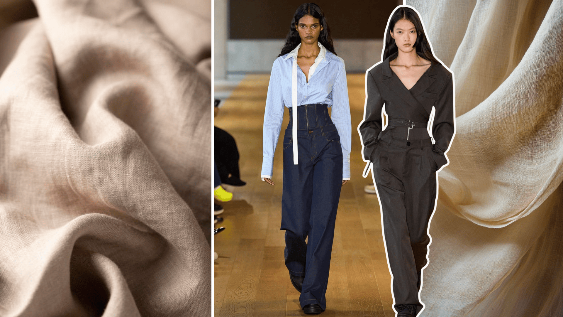
Color is more than visual pleasure — it’s emotion, psychology, and design in harmony. Every shade tells a story, every contrast evokes feeling, and every palette shapes identity. In the world of textiles and fashion, mastering color theory isn’t just about aesthetics — it’s about communication through color.
At Anuprerna, where each handwoven fabric carries centuries of craft and character, understanding color palette, which is the bridge between tradition and modern design. Let’s decode the language of hues and how it shapes what we wear, feel, and express.
What Is Color Theory?
Color theory is the science and art of how colors interact — how they complement, contrast, or harmonize to create balance and meaning.
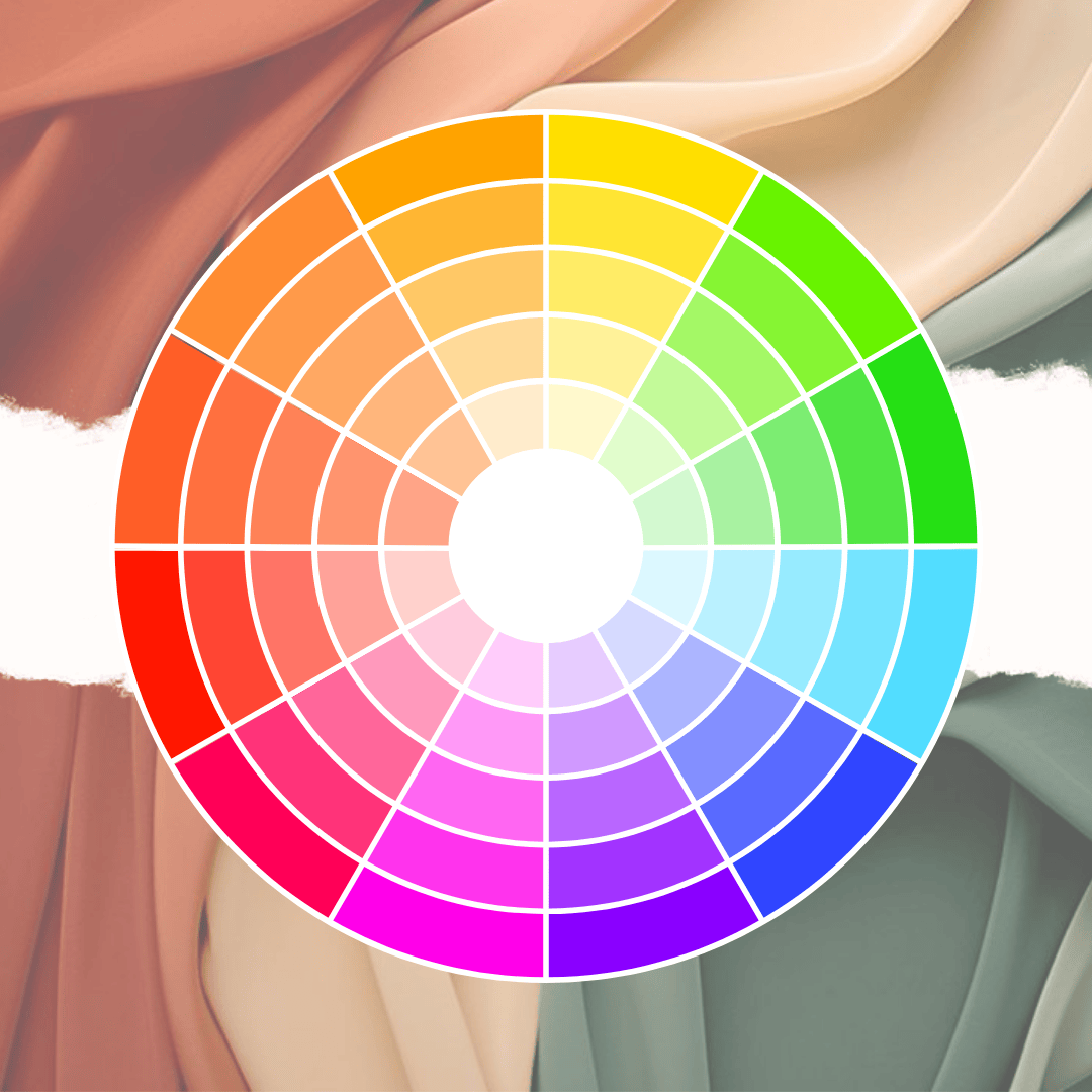
At its heart lies the color wheel, The basis of color theory is the belief that color is important and that individual hues, color values, and saturation levels affect the mood of a visual.
The three pillars of color theory:
- Primary Colors: Red, Blue, Yellow — the base hues that create all others.
- Secondary Colors: Green, Orange, Purple — formed by mixing primaries.
- Tertiary Colors: Blends like red-orange, blue-green — subtle connectors in design.
In fashion and textiles, color theory helps designers craft palettes that evoke emotion and identity, from calm neutrals to bold contrasts.
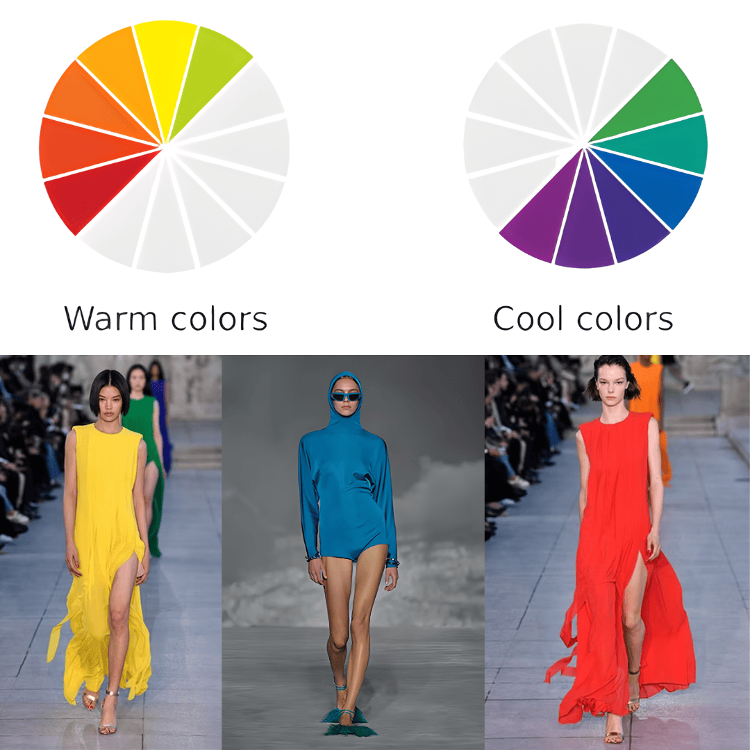
Color properties and color contrast
Half of the color wheel consists of warm colors, and the other half contains cool hues.
Color temperature can create various psychological effects on the viewer.
Warm colors are yellow, orange and red, and cool colors are green, blue and purple. Turquoise and scarlet (which is orange-red) form the greatest cool-warm contrast. Within each color, there are also cooler and warmer tones.
Understanding Color Relationships
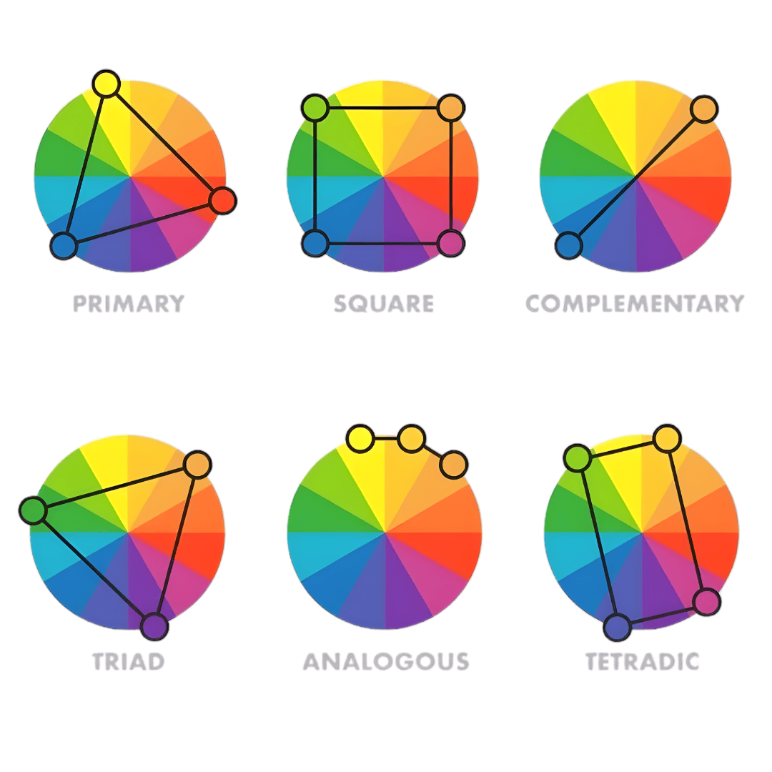
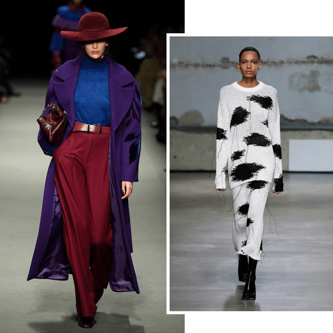
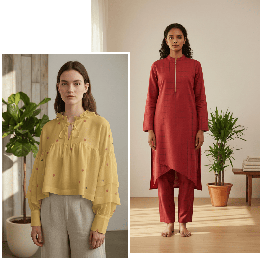
- Complementary Colors- Opposites on the color wheel (like blue and orange) create striking contrast. In clothing: Perfect for confident, high-impact looks — think indigo jackets with rust scarves or mustard shirts with navy trousers.
- Analogous Colors- Neighbors on the wheel (like green, teal, and blue) form natural harmony.
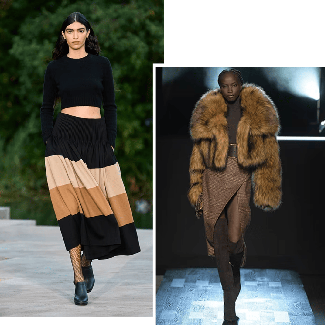
In textiles: Ideal for layered looks — soft tonal gradients in handwoven linen or naturally dyed cottons. - Monochromatic Colors- Different shades, tints, or tones of one hue.
In styling: A single-color outfit in varying intensities — such as a gradient from pale sand to deep camel — creates depth without loudness. - Triadic Colors- Three hues evenly spaced around the wheel (like red, yellow, and blue).
In craft and design: Often used in folk art, handloom borders, and block prints to create vibrant balance. - Tetradic color- This color scheme, also known as a double complementary scheme, uses four colors arranged into two complementary pairs that form a rectangle on the color wheel.
The Psychology of Color in Clothing
Colors affect how we feel and how others perceive us. In fashion, every shade carries subtle psychology:
- White: Purity, simplicity, calm — perfect for summer cottons.
- Blue: Stability, peace, trust — seen in indigo-dyed fabrics.
- Yellow: Optimism and energy — common in festive wear and natural dye collections.
- Green: Balance and growth — reminds us of sustainability and nature.
- Red: Passion and confidence — a classic accent in artisanal motifs.
- Black & Grey: Power and sophistication — timeless tones in minimalist wardrobes.
At Anuprerna, we see color as mood — each naturally dyed hue mirrors the rhythm of life, not the trend of the season.
How to Use Color Theory in Dressing
Here’s how you can apply color theory to your own wardrobe:
- Start Neutral: Whites, creams, greys, and navy make the perfect base.
- Add One Accent: Introduce a single bold hue — indigo, saffron, or emerald — for focus.
- Play with Tone: Combine lighter and darker versions of the same color for dimension.
- Mind the Mood: Choose warm tones for energy (reds, yellows) and cool tones for calm (blues, greens).
- Use Natural Palettes: Vegetable-dyed fabrics offer organic harmony unmatched by artificial hues.
The Anuprerna Perspective: Color as Craft
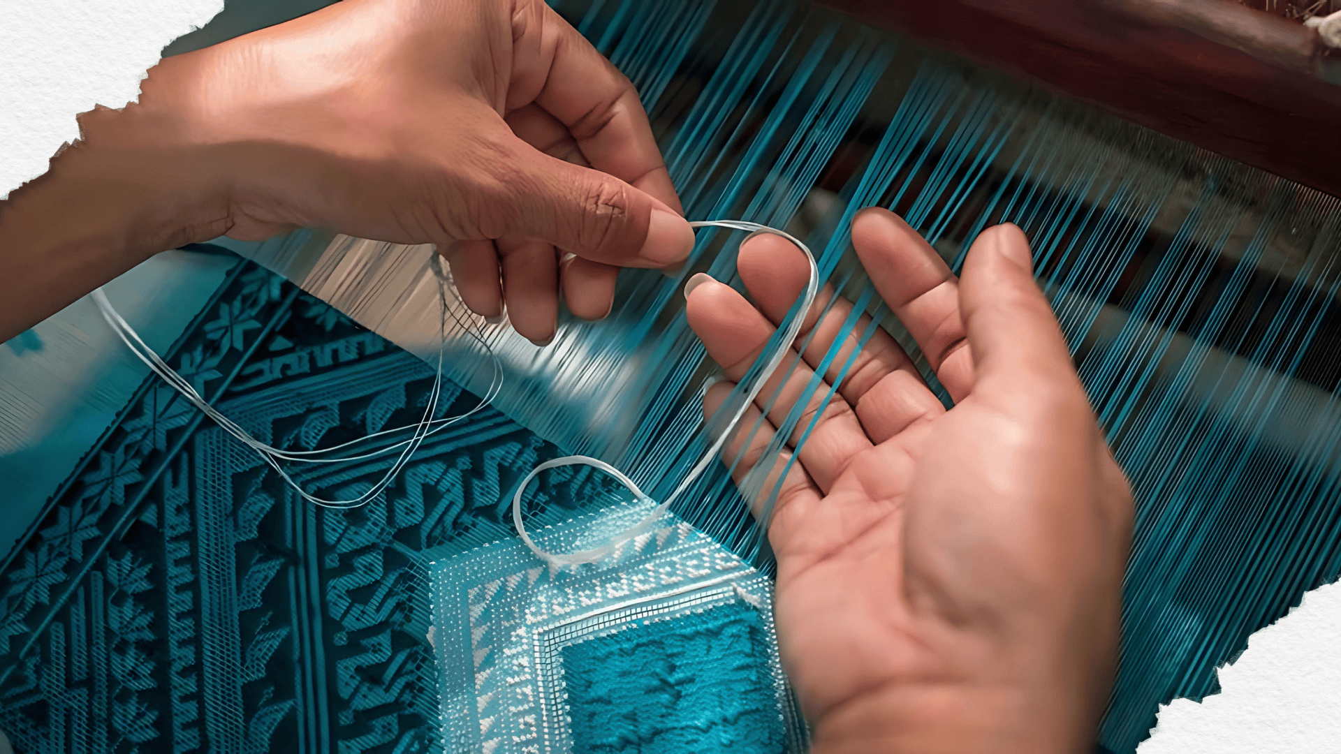
At Anuprerna, color is not added — it’s woven in.
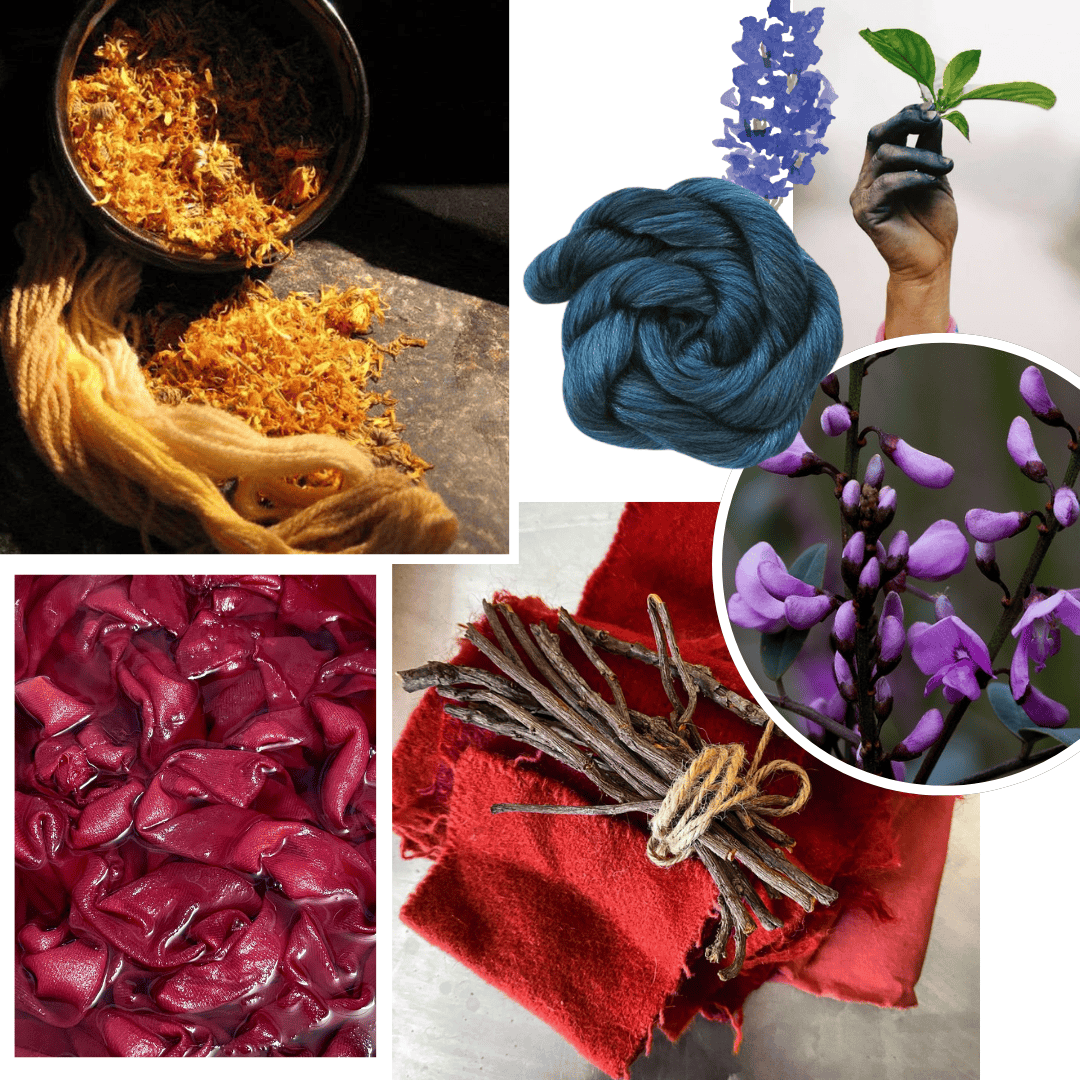
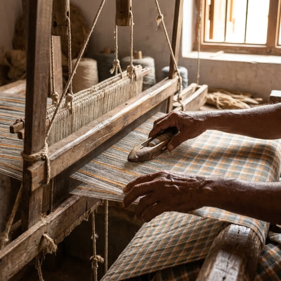
Our artisans work with natural and azo-free dyes derived from indigo, madder root, turmeric, marigold, and pomegranate rind, ensuring that every hue is safe for skin and kind to the planet.
We don’t chase color trends — we preserve pigment traditions.
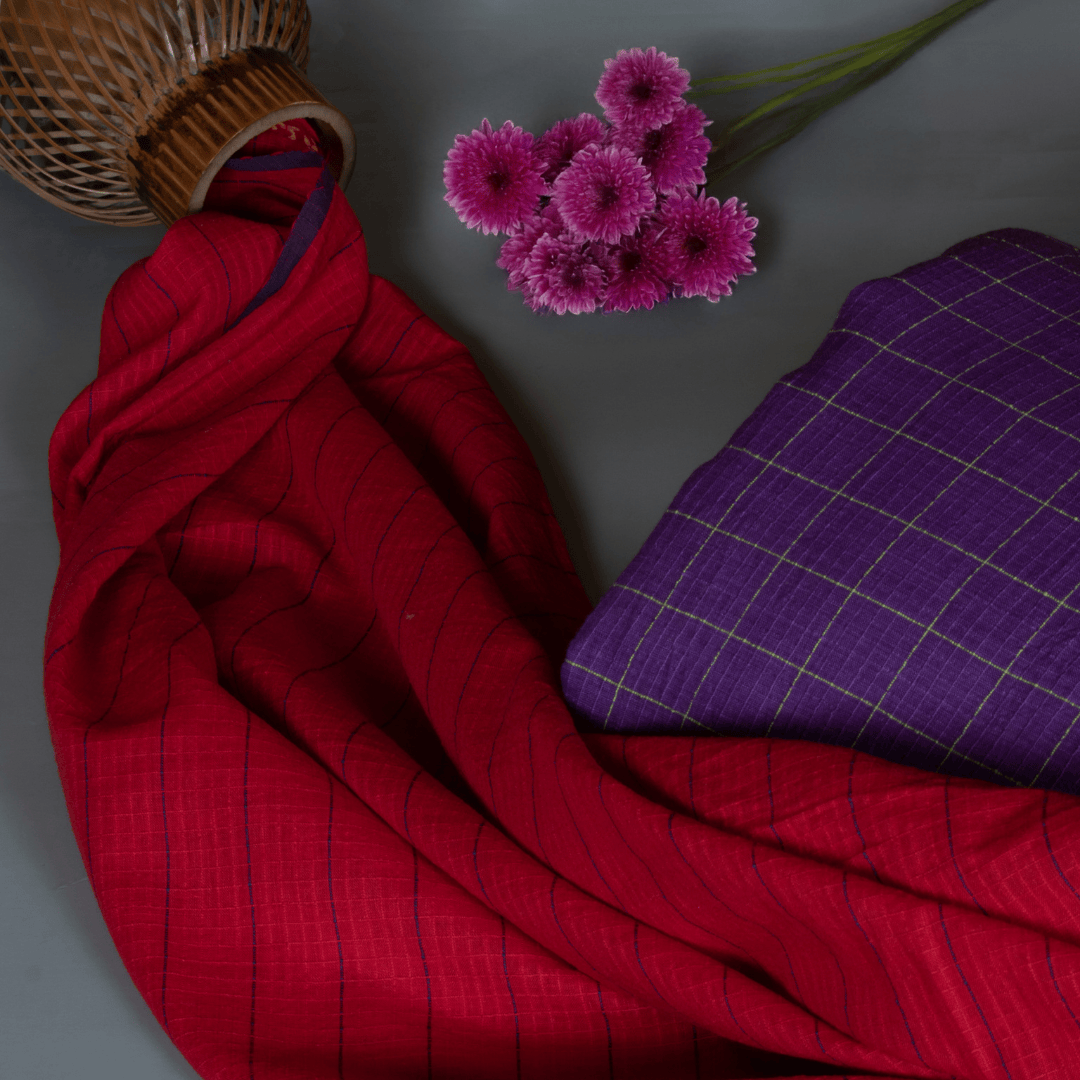
Each fabric — whether Jamdani, Khadi, or Matka silk — tells a chromatic story of soil, water, and hands that shaped it.
In a fast-fashion world, our color theory begins where nature does — in patience, depth, and imperfection.
Conclusion: Seeing Color Differently
Color theory isn’t just for designers; it’s for anyone who dresses with awareness. The next time you choose an outfit, notice how its colors make you feel.
Because true style doesn’t start with what’s in trend — it starts with understanding how color connects with you.
At Anuprerna, every hue has a heartbeat, and every fabric, a feeling — proof that when color meets craft, fashion becomes poetry.
Explore Anuprerna’s Collections With Different Color Palette
related questions
What is color theory and why is it important in fashion?
Color theory is the study of how colors interact, complement, and influence emotions. In fashion, it helps designers and consumers create harmony, contrast, and balance in clothing — making outfits look intentional rather than random.
Color theory is the study of how colors interact, complement, and influence emotions. In fashion, it helps designers and consumers create harmony, contrast, and balance in clothing — making outfits look intentional rather than random.
Colors evoke emotions and perceptions. Red signals power and energy. Blue conveys calm and trust. Green represents nature and balance. Yellow exudes optimism. Understanding color psychology helps brands and consumers align outfits with mood, season, and purpose.
How can I apply color theory when choosing clothes?
Lighting changes how colors appear. Natural light shows true hues. Warm indoor light makes colors appear yellower or redder. Cool fluorescent light can dull warm tones. This is why artisans at Anuprerna dye and finish fabrics under natural light to ensure authenticity.
Why are neutral colors so important in styling?
Neutrals form the foundation of timeless style. They pair easily with any accent color, balance bright tones, and suit all skin tones. In handlooms, neutral shades like beige, ivory, and indigo showcase the texture and weave beautifully.
More Blogs
how celebrity environmental activists are shaping sustainable fashion trends
summer 2026 textile trends: the season of slow luxury
the style blueprint: 5 simple rules to improve dressing sense instantly
top 5 textures to watch in fashion trends 2025
beyond borders: how fashion designers reimagine indian handloom in global fashion

5 key design elements in fashion and styling behind every great look


